# Layout Components
The Layout components mimic the Auto Layout feature from Figma and come with everything you need to build responsive designs.
# Box (opens new window)
The Box component creates spacings around components and provides positioning options. Tip: To make components more reusable, avoid adding outer spacings directly to them; instead, wrap them in a Box component.
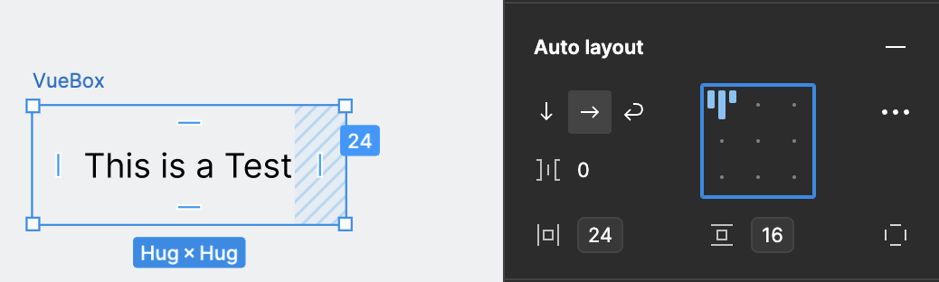
<vue-box padding="16 24">
    <vue-text>This is a Test</vue-text>
</vue-box>
# Columns (opens new window)
Columns provide horizontal spacings between components. By default, components are equally distributed, but each column can have a specific width. Columns can be stacked, making them ideal for creating forms or general layouts. Tip: Columns don't provide vertical space, so pair them with the Stack component.
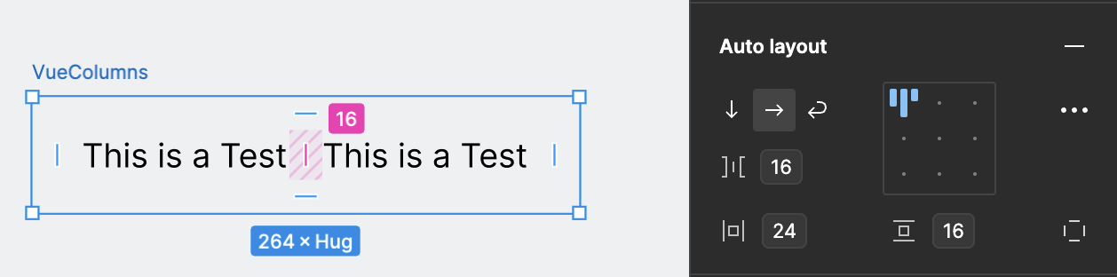
<vue-columns space="16" padding="16 24">
    <vue-column>
        <vue-text>This is a Test</vue-text>
    </vue-column>
    <vue-column>
        <vue-text>This is a Test</vue-text>
    </vue-column>
</vue-columns>
# ContentBlock (opens new window)
The ContentBlock component sets a maximum width for all breakpoints, limiting the content width of a page or component.
# Inline (opens new window)
Inline provides both horizontal and vertical spacings between components, displaying them with their inline width. It can be stacked and is excellent for creating a list of elements.
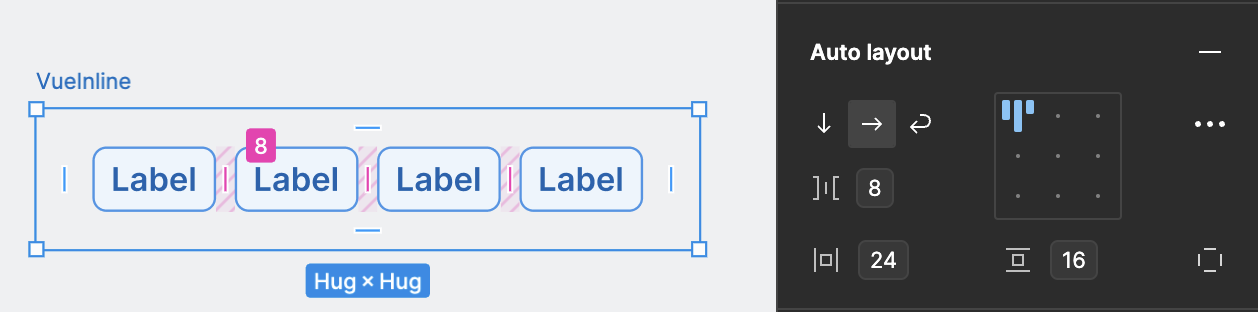
<vue-inline space="8" padding="16 24">
    <vue-badge>Label</vue-badge>
    <vue-badge>Label</vue-badge>
    <vue-badge>Label</vue-badge>
    <vue-badge>Label</vue-badge>
</vue-inline>
# Masonry (opens new window)
Masonry offers horizontal and vertical spacings between components, displaying them with equal width and varying height. Tip: It supports only 3 columns and has a fixed responsive behavior.
# Stack (opens new window)
Stack provides vertical spacings between components, displaying them with their original height.
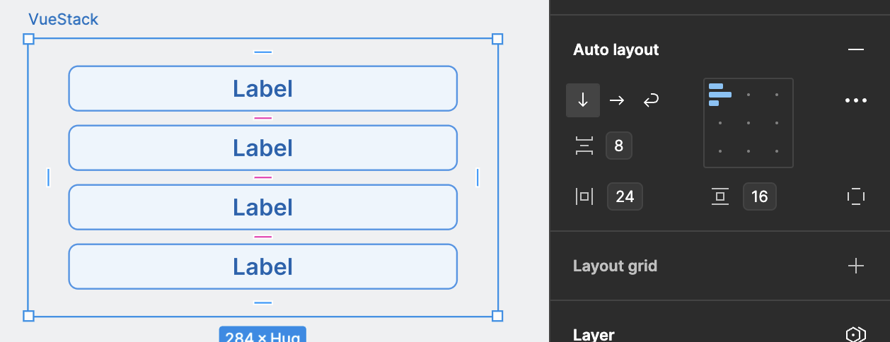
<vue-stack space="8" padding="16 24">
    <vue-badge>Label</vue-badge>
    <vue-badge>Label</vue-badge>
    <vue-badge>Label</vue-badge>
    <vue-badge>Label</vue-badge>
</vue-stack>
# Tiles (opens new window)
Tiles provide both horizontal and vertical spacings between components. Components are equally distributed by default. Tip: You can configure the number of columns as well as the vertical and horizontal space independently.